Kimono for Couples: How to Match Colors Without Looking Too “Touristy”
Many couples love renting kimono in Osaka, but choosing the wrong color combination can make the outfit feel loud or overly “touristy.”
With a few simple styling principles used by Japanese kimono coordinators and local photographers, you can create a natural, elegant look that blends beautifully into Osaka’s streets — without matching like a costume.
Here’s how to coordinate kimono as a couple in a way that feels stylish, modern, and authentically Japanese.
■ Why Some Couples Look “Touristy” in Kimono
Couple outfits often stand out for the wrong reasons. Local stylists say these are the most common causes:
• pairing bright primary colors together (red × blue, purple × yellow)
• both choosing bold patterns that compete visually
• mixing too many accessory colors (bags, obis, zori, hairpieces)
• wearing colors that don’t match the season
In Japan, harmony matters more than matching. When the two outfits blend naturally rather than loudly, the look becomes sophisticated instead of tourist-like.
■ How to Match as a Couple Without Over-Matching
Local kimono dressers recommend a simple framework — one that works for any couple, in any season.
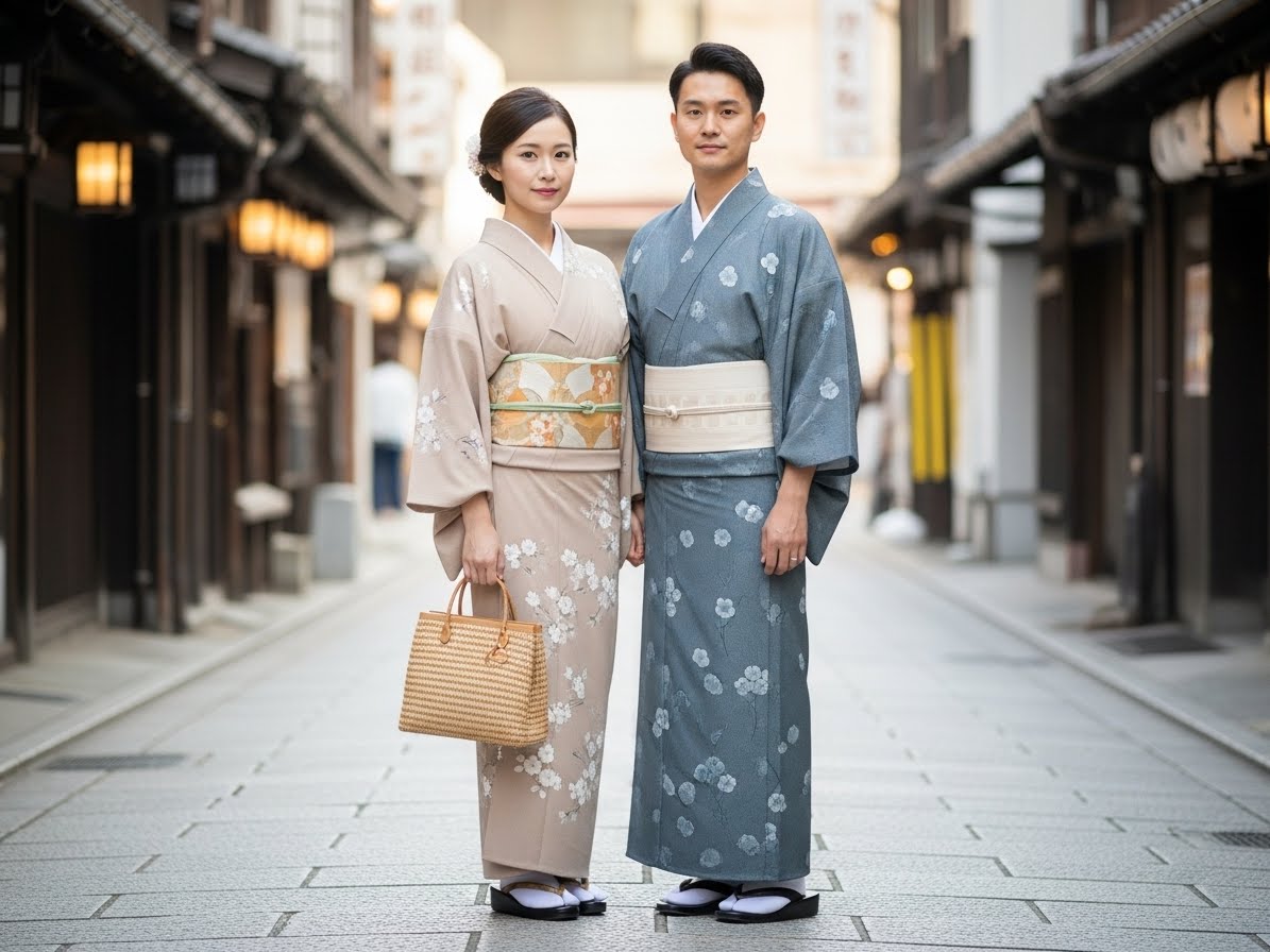
■ Choose Similar or Neighboring Colors
The easiest way to look coordinated (not costumed) is to use colors from the same family or next to each other on the color wheel.
Beautiful combinations include:
• beige × brown — calm, classic, elegant
• navy × teal — modern, cool-toned harmony
• dusty pink × gray-purple — soft and photogenic
• light gray × white — minimalist and refined
• deep green × beige — natural and perfect for Osaka’s parks
Avoid complete opposites like red × green or yellow × purple. These are high-contrast pairings and feel more like festival costumes than daily kimono.
■ Let One Outfit Be Simpler Than the Other
Professional stylists rarely put two bold patterns together.
A balanced couple style is usually:
• one person in a patterned kimono
• one person in a simple or solid kimono
This creates visual harmony and makes photos look polished.
For example:
• men often wear solid colors or subtle stripes
• women choose patterns — florals, geometric motifs, seasonal designs
Of course, reversing the roles also works beautifully.
■ Link the Look With Obi Colors
If you want an effortless but stylish way to match:
• connect the outfits through the obi (sash)
• or choose one small shared color in accessories
Examples:
• navy obi × beige obi → linked by white accessories
• dusty pink obi × soft gray obi → linked by gold accents
It’s subtle, classy, and instantly creates a “couple look” without being identical.
■ Limit Accessories to Two or Three Colors
Too many colors → instantly touristy.
Kimono looks its best when:
• zori
• bags
• haori
• small ribbons or cords
stay within a controlled color palette.
White, beige, black, or gold work with almost anything.
■ Best Color Palettes for Each Season in Osaka
Kimono coordination becomes even stronger when you use seasonal tones — a key part of Japanese aesthetics.
■ Spring
Soft and romantic, matching the cherry blossom atmosphere.
• dusty pink
• beige
• mint green
• pale blue
• sakura × soft gray
■ Summer
Bright, airy colors inspired by rivers, festivals, and blue skies.
• light blue
• navy
• cream
• white × blue combinations
■ Autumn
Rich, warm tones that blend with Osaka Castle Park and Nakanoshima.
• warm brown
• deep green
• ochre
• wine red
• taupe
■ Winter
Cool, elegant combinations that look stunning under lights and snow.
• black × gray
• navy × white
• dark green × beige
• burgundy × cream
Seasonal tones always look more natural — and always photograph better.
■ Best Osaka Locations for “Non-Touristy” Couple Photos
Where you take photos matters just as much as what you wear.
Hozenji Yokocho
Stone paths, lanterns, and shadows that flatter kimono. Calm, intimate, and full of atmosphere.
Nakazakicho
Retro shops, vintage walls, and muted tones that make soft-colored kimono shine.
Osaka Castle Outer Moat
Wide paths, greenery, and space to pose without crowds.
Nakanoshima Banks
Modern riverside scenery that pairs well with simple, minimalist kimono outfits.
These locations naturally enhance a refined couple look — without the “Dotonbori tourist energy.”
■ How Rental Shops in Osaka Recommend Couples Coordinate
Local staff share a practical formula that works almost every time:
1) Choose the man’s color first
Men’s kimono are usually simpler, so deciding this makes choosing the partner’s outfit easier.
2) Pick colors based on the photo background
• Dotonbori → dusty or muted tones blend well
• Osaka Castle → blues, whites, greens look vivid
• Nakazakicho → beige, soft neutrals match the retro aesthetic
3) Avoid crowded, flashy areas for the main photos
Quiet lanes, shrines, and cafés create more natural, elegant shots.
■ Example Outfit Ideas for Real Couples
Modern & Minimal
Man: light gray kimono × black obi
Woman: white kimono × dusty pink obi
Shared detail: black zori
Perfect for Nakanoshima or Umeda area.
Traditional Calm
Man: deep navy kimono × beige obi
Woman: beige kimono × navy obi
Perfect for Hozenji Yokocho or Namba alleys.
Retro Vintage
Man: dark green kimono × brown obi
Woman: beige kimono × deep green obi
Perfect for Nakazakicho’s nostalgic streets.
■ Quick FAQ for Couples Wearing Kimono
Do we look touristy if we match?
→ Only if the outfits are identical. Subtle coordination looks natural.
Is men’s kimono too plain?
→ Add color through the obi or haori cords.
What if our body sizes differ?
→ Darker tones on the taller or broader partner create balance.
■ Final Thoughts
Coordinating kimono as a couple doesn’t mean matching perfectly.
It means choosing colors that harmonize, simplifying patterns, and letting your surroundings guide the mood.
By following these simple principles, you can walk around Osaka looking like a naturally stylish pair — not a costume-y duo — and your photos will reflect that graceful, authentic charm.