The Kimono Color Palette: Which Colors Look Best in Photos?
When renting a kimono in Osaka, color is one of the biggest choices you’ll make. The right palette can brighten your skin tone, match the mood of your photos, and help your outfit stand out against iconic backdrops like Dotonbori, Shinsaibashi, Osaka Castle, and the riverwalk.
This guide breaks down which kimono colors photograph best — and why certain shades shine more in different lighting conditions.
■ Soft Pastels — Flattering and Universally Photogenic
Pastel tones such as pale pink, mint, lavender, and sky blue create a gentle, dreamy atmosphere.
They photograph beautifully in natural light and tend to complement many skin tones.
Why they work well:
• soften the overall look
• blend naturally with daylight
• perfect for spring or early morning photos
Best locations in Osaka:
• Osaka Castle Park (cherry blossoms or greenery)
• Namba Yasaka Shrine
• Morning shots near the Dotonbori River
These colors give a classic, romantic feel that matches the elegance of kimono culture.
■ Deep Reds and Burgundy — Bold, Traditional, and Timeless
Red is one of the most iconic kimono colors in Japanese history. In photos, it creates instant visual impact and conveys strength and elegance.
Why they photograph well:
• strong contrast against city backgrounds
• rich tonality even in low light
• ideal for night photography
Best locations in Osaka:
• Dotonbori’s neon signs
• Shinsaibashi shopping street
• Umeda night views
If you want your kimono to stand out in busy street scenes, red is one of the most reliable choices.
■ Elegant Navy and Deep Blue — Sharp Lines and Clear Silhouette
Navy kimonos look crisp and refined in photos.
The dark tone enhances your silhouette, making the kimono shape more defined.
Why they work:
• excellent contrast with bright backgrounds
• look balanced in both daylight and evening
• flatter most body shapes due to their slimming effect
Best locations:
• Dotonbori at blue hour
• Osaka Station City rooftop
• Inside temples or shrines for a calm mood
Navy is perfect for those who want a modern, clean style that still feels traditional.
■ Whites and Creams — Minimalistic and Light-Filled
White, ivory, and soft beige give a pure and elegant impression.
These tones reflect light beautifully and make your photos look airy and bright.
Why they are photogenic:
• lift the overall exposure of the image
• look stunning during daytime or indoors
• pair well with metallic hair accessories
Best locations:
• Osaka Castle’s stone walls
• Bright cafés in Shinsaibashi
• Riverside walkways on sunny days
These colors are ideal if you prefer a refined, minimalist aesthetic.
■ Black Kimono — Strong Contrast and Night-Friendly
Black may seem dramatic, but it’s one of the most powerful colors for photography.
Why it works well:
• creates a striking contrast against neon lights
• highlights accessories and obi patterns
• makes skin tones look smooth in evening lighting
Best locations:
• Dotonbori at night
• Hozenji Yokocho lantern alley
• Retro streets in Shinsekai
For a chic and modern look, black is unbeatable.
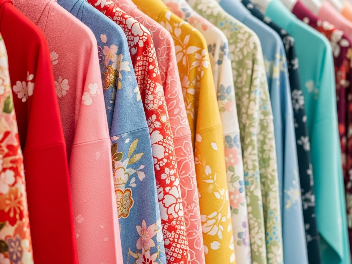
■ Floral Multicolor Patterns — Dynamic and Eye-Catching
Floral kimonos with multiple tones can look incredible on camera, especially in Osaka’s colorful neighborhoods.
Why they shine in photos:
• add visual depth and movement
• look lively in both close-up and full-body shots
• pair well with seasonal flowers or nature spots
Best locations:
• Osaka Castle’s garden areas
• Namba Parks rooftop garden
• Spring or autumn foliage locations
If you want vibrant, cheerful photos, multicolored florals are a great match.
■ How Lighting Changes Kimono Color in Photos
The same kimono can look completely different depending on when you take pictures:
• Morning light → softer, pastel-friendly
• Midday sunlight → enhances bold colors but creates strong shadows
• Late afternoon → adds warmth to reds, oranges, and cream tones
• Blue hour → ideal for dark colors like navy and black
• Nighttime → neon signs enhance red, gold, and black the most
Understanding lighting helps you choose a color that will look its best at the time you plan to explore Osaka.
■ Choosing a Kimono Color Based on Skin Tone
While personal preference is most important, these simple guidelines help create balance:
• Fair skin → deep reds, navy, pastel blue, lavender
• Medium tones → emerald, peach, cream, burgundy
• Warm undertones → mustard, coral, off-white, sage green
• Cool undertones → lilac, ice blue, deep purple, grey
A color that complements your undertone will naturally brighten your face in photos.
■ Final Recommendation
If you want simplicity, go pastel.
If you want boldness, choose red.
If you want elegance, choose navy or ivory.
If you want night shots, choose black or deep blue.
The best kimono color is the one that aligns with your mood, the environment, and the story you want your Osaka photos to tell. With the right palette, your kimono experience becomes not only memorable — but beautifully photogenic.